User login
The most important question in medicine
Welcome to Impact Factor, your weekly dose of commentary on a new medical study. I’m Dr. F. Perry Wilson of the Yale School of Medicine.
Today I am going to tell you the single best question you can ask any doctor, the one that has saved my butt countless times throughout my career, the one that every attending physician should be asking every intern and resident when they present a new case. That question: “What else could this be?”
I know, I know – “When you hear hoofbeats, think horses, not zebras.” I get it. But sometimes we get so good at our jobs, so good at recognizing horses, that we stop asking ourselves about zebras at all. You see this in a phenomenon known as “anchoring bias” where physicians, when presented with a diagnosis, tend to latch on to that diagnosis based on the first piece of information given, paying attention to data that support it and ignoring data that point in other directions.
That special question: “What else could this be?”, breaks through that barrier. It forces you, the medical team, everyone, to go through the exercise of real, old-fashioned differential diagnosis. And I promise that if you do this enough, at some point it will save someone’s life.
Though the concept of anchoring bias in medicine is broadly understood, it hasn’t been broadly studied until now, with this study appearing in JAMA Internal Medicine.
Here’s the setup.
The authors hypothesized that there would be substantial anchoring bias when patients with heart failure presented to the emergency department with shortness of breath if the triage “visit reason” section mentioned HF. We’re talking about the subtle difference between the following:
- Visit reason: Shortness of breath
- Visit reason: Shortness of breath/HF
People with HF can be short of breath for lots of reasons. HF exacerbation comes immediately to mind and it should. But there are obviously lots of answers to that “What else could this be?” question: pneumonia, pneumothorax, heart attack, COPD, and, of course, pulmonary embolism (PE).
The authors leveraged the nationwide VA database, allowing them to examine data from over 100,000 patients presenting to various VA EDs with shortness of breath. They then looked for particular tests – D-dimer, CT chest with contrast, V/Q scan, lower-extremity Doppler — that would suggest that the doctor was thinking about PE. The question, then, is whether mentioning HF in that little “visit reason” section would influence the likelihood of testing for PE.
I know what you’re thinking: Not everyone who is short of breath needs an evaluation for PE. And the authors did a nice job accounting for a variety of factors that might predict a PE workup: malignancy, recent surgery, elevated heart rate, low oxygen saturation, etc. Of course, some of those same factors might predict whether that triage nurse will write HF in the visit reason section. All of these things need to be accounted for statistically, and were, but – the unofficial Impact Factor motto reminds us that “there are always more confounders.”
But let’s dig into the results. I’m going to give you the raw numbers first. There were 4,392 people with HF whose visit reason section, in addition to noting shortness of breath, explicitly mentioned HF. Of those, 360 had PE testing and two had a PE diagnosed during that ED visit. So that’s around an 8% testing rate and a 0.5% hit rate for testing. But 43 people, presumably not tested in the ED, had a PE diagnosed within the next 30 days. Assuming that those PEs were present at the ED visit, that means the ED missed 95% of the PEs in the group with that HF label attached to them.
Let’s do the same thing for those whose visit reason just said “shortness of breath.”
Of the 103,627 people in that category, 13,886 were tested for PE and 231 of those tested positive. So that is an overall testing rate of around 13% and a hit rate of 1.7%. And 1,081 of these people had a PE diagnosed within 30 days. Assuming that those PEs were actually present at the ED visit, the docs missed 79% of them.
There’s one other thing to notice from the data: The overall PE rate (diagnosed by 30 days) was basically the same in both groups. That HF label does not really flag a group at lower risk for PE.
Yes, there are a lot of assumptions here, including that all PEs that were actually there in the ED got caught within 30 days, but the numbers do paint a picture. In this unadjusted analysis, it seems that the HF label leads to less testing and more missed PEs. Classic anchoring bias.
The adjusted analysis, accounting for all those PE risk factors, really didn’t change these results. You get nearly the same numbers and thus nearly the same conclusions.
Now, the main missing piece of this puzzle is in the mind of the clinician. We don’t know whether they didn’t consider PE or whether they considered PE but thought it unlikely. And in the end, it’s clear that the vast majority of people in this study did not have PE (though I suspect not all had a simple HF exacerbation). But this type of analysis is useful not only for the empiric evidence of the clinical impact of anchoring bias but because of the fact that it reminds us all to ask that all-important question: What else could this be?
F. Perry Wilson, MD, MSCE, is an associate professor of medicine and director of Yale’s Clinical and Translational Research Accelerator in New Haven, Conn. He reported no conflicts of interest.
A version of this article first appeared on Medscape.com.
The cardiopulmonary effects of mask wearing
This transcript has been edited for clarity.
Welcome to Impact Factor, your weekly dose of commentary on a new medical study. I’m Dr. F. Perry Wilson of the Yale School of Medicine.
There was a time when I would have had to explain to you what an N95 mask is, how it is designed to filter out 95% of fine particles, defined as stuff in the air less than 2.5 microns in size.
But of course, you know that now. The N95 had its moment – a moment that seemed to be passing as the concentration of airborne coronavirus particles decreased.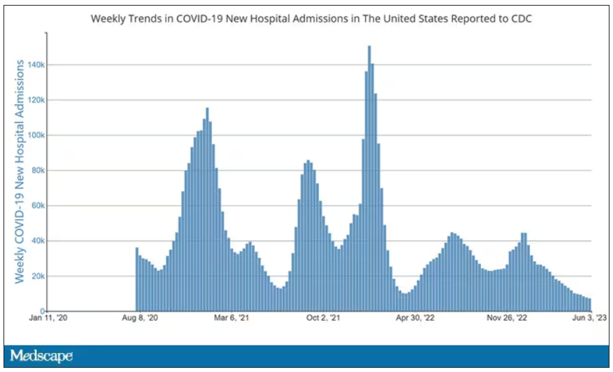
But, as the poet said, all that is less than 2.5 microns in size is not coronavirus. Wildfire smoke is also chock full of fine particulate matter. And so, N95s are having something of a comeback.
That’s why an article that took a deep look at what happens to our cardiovascular system when we wear N95 masks caught my eye.
Mask wearing has been the subject of intense debate around the country. While the vast majority of evidence, as well as the personal experience of thousands of doctors, suggests that wearing a mask has no significant physiologic effects, it’s not hard to find those who suggest that mask wearing depletes oxygen levels, or leads to infection, or has other bizarre effects.
In a world of conflicting opinions, a controlled study is a wonderful thing, and that’s what appeared in JAMA Network Open.
This isn’t a huge study, but it’s big enough to make some important conclusions. Thirty individuals, all young and healthy, half female, were enrolled. Each participant spent 3 days in a metabolic chamber; this is essentially a giant, airtight room where all the inputs (oxygen levels and so on) and outputs (carbon dioxide levels and so on) can be precisely measured.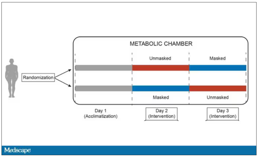
After a day of getting used to the environment, the participants spent a day either wearing an N95 mask or not for 16 waking hours. On the next day, they switched. Every other variable was controlled, from the calories in their diet to the temperature of the room itself.
They engaged in light exercise twice during the day – riding a stationary bike – and a host of physiologic parameters were measured. The question being, would the wearing of the mask for 16 hours straight change anything?
And the answer is yes, some things changed, but not by much.
Here’s a graph of the heart rate over time. You can see some separation, with higher heart rates during the mask-wearing day, particularly around 11 a.m. – when light exercise was scheduled.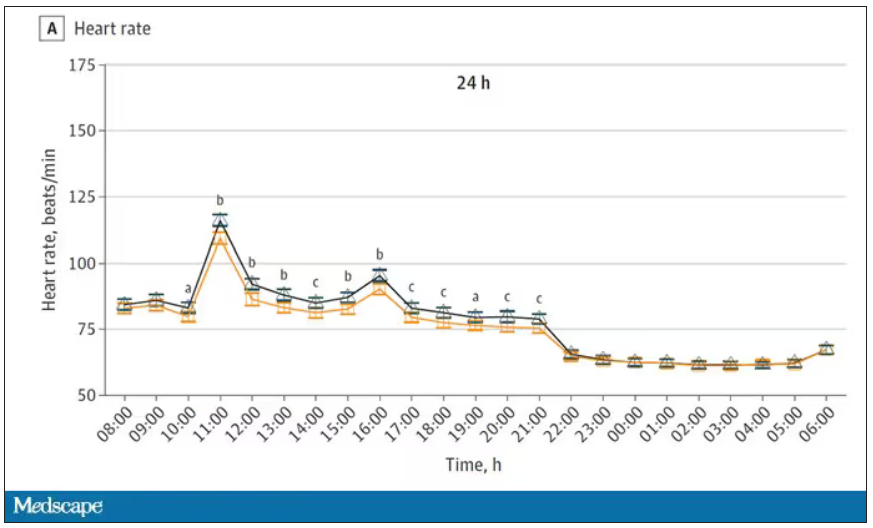
Zooming in on the exercise period makes the difference more clear. The heart rate was about eight beats/min higher while masked and engaging in exercise. Systolic blood pressure was about 6 mm Hg higher. Oxygen saturation was lower by 0.7%.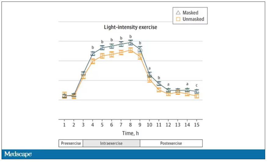
So yes, exercising while wearing an N95 mask might be different from exercising without an N95 mask. But nothing here looks dangerous to me. The 0.7% decrease in oxygen saturation is smaller than the typical measurement error of a pulse oximeter. The authors write that venous pH decreased during the masked day, which is of more interest to me as a nephrologist, but they don’t show that data even in the supplement. I suspect it didn’t decrease much.
They also showed that respiratory rate during exercise decreased in the masked condition. That doesn’t really make sense when you think about it in the context of the other findings, which are all suggestive of increased metabolic rate and sympathetic drive. Does that call the whole procedure into question? No, but it’s worth noting.
These were young, healthy people. You could certainly argue that those with more vulnerable cardiopulmonary status might have had different effects from mask wearing, but without a specific study in those people, it’s just conjecture. Clearly, this study lets us conclude that mask wearing at rest has less of an effect than mask wearing during exercise.
But remember that, in reality, we are wearing masks for a reason. One could imagine a study where this metabolic chamber was filled with wildfire smoke at a concentration similar to what we saw in New York. In that situation, we might find that wearing an N95 is quite helpful. The thing is, studying masks in isolation is useful because you can control so many variables. But masks aren’t used in isolation. In fact, that’s sort of their defining characteristic.
F. Perry Wilson, MD, MSCE, is an associate professor of medicine and director of Yale’s Clinical and Translational Research Accelerator. He reported no conflicts of interest.
A version of this article first appeared on Medscape.com.
COVID boosters effective, but not for long
This transcript has been edited for clarity.
Welcome to Impact Factor, your weekly dose of commentary on a new medical study.
I am here today to talk about the effectiveness of COVID vaccine boosters in the midst of 2023. The reason I want to talk about this isn’t necessarily to dig into exactly how effective vaccines are. This is an area that’s been trod upon multiple times. But it does give me an opportunity to talk about a neat study design called the “test-negative case-control” design, which has some unique properties when you’re trying to evaluate the effect of something outside of the context of a randomized trial.
So, just a little bit of background to remind everyone where we are. These are the number of doses of COVID vaccines administered over time throughout the pandemic.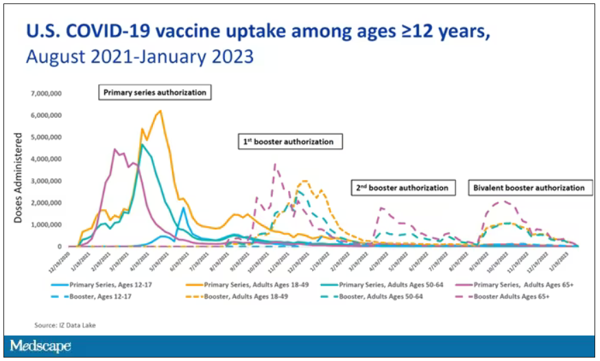
You can see that it’s stratified by age. The orange lines are adults ages 18-49, for example. You can see a big wave of vaccination when the vaccine first came out at the start of 2021. Then subsequently, you can see smaller waves after the first and second booster authorizations, and maybe a bit of a pickup, particularly among older adults, when the bivalent boosters were authorized. But still very little overall pickup of the bivalent booster, compared with the monovalent vaccines, which might suggest vaccine fatigue going on this far into the pandemic. But it’s important to try to understand exactly how effective those new boosters are, at least at this point in time.
I’m talking about Early Estimates of Bivalent mRNA Booster Dose Vaccine Effectiveness in Preventing Symptomatic SARS-CoV-2 Infection Attributable to Omicron BA.5– and XBB/XBB.1.5–Related Sublineages Among Immunocompetent Adults – Increasing Community Access to Testing Program, United States, December 2022–January 2023, which came out in the Morbidity and Mortality Weekly Report very recently, which uses this test-negative case-control design to evaluate the ability of bivalent mRNA vaccines to prevent hospitalization.
The question is: Does receipt of a bivalent COVID vaccine booster prevent hospitalizations, ICU stay, or death? That may not be the question that is of interest to everyone. I know people are interested in symptoms, missed work, and transmission, but this paper was looking at hospitalization, ICU stay, and death.
What’s kind of tricky here is that the data they’re using are in people who are hospitalized with various diseases. You might look at that on the surface and say: “Well, you can’t – that’s impossible.” But you can, actually, with this cool test-negative case-control design.
Here’s basically how it works. You take a population of people who are hospitalized and confirmed to have COVID. Some of them will be vaccinated and some of them will be unvaccinated. And the proportion of vaccinated and unvaccinated people doesn’t tell you very much because it depends on how that compares with the rates in the general population, for instance. Let me clarify this. If 100% of the population were vaccinated, then 100% of the people hospitalized with COVID would be vaccinated. That doesn’t mean vaccines are bad. Put another way, if 90% of the population were vaccinated and 60% of people hospitalized with COVID were vaccinated, that would actually show that the vaccines were working to some extent, all else being equal. So it’s not just the raw percentages that tell you anything. Some people are vaccinated, some people aren’t. You need to understand what the baseline rate is.
The test-negative case-control design looks at people who are hospitalized without COVID. Now who those people are (who the controls are, in this case) is something you really need to think about. In the case of this CDC study, they used people who were hospitalized with COVID-like illnesses – flu-like illnesses, respiratory illnesses, pneumonia, influenza, etc. This is a pretty good idea because it standardizes a little bit for people who have access to healthcare. They can get to a hospital and they’re the type of person who would go to a hospital when they’re feeling sick. That’s a better control than the general population overall, which is something I like about this design.
Some of those people who don’t have COVID (they’re in the hospital for flu or whatever) will have been vaccinated for COVID, and some will not have been vaccinated for COVID. And of course, we don’t expect COVID vaccines necessarily to protect against the flu or pneumonia, but that gives us a way to standardize.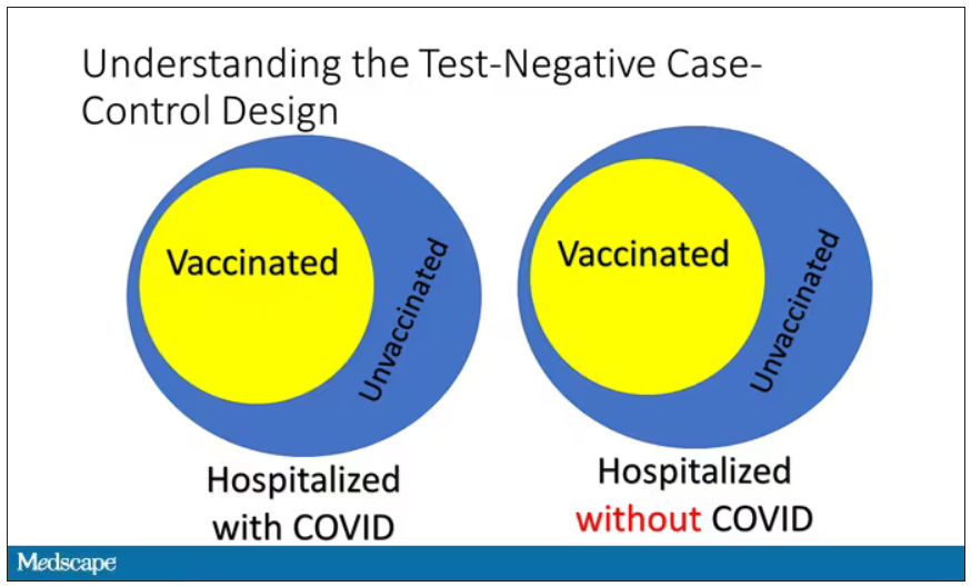
If you look at these Venn diagrams, I’ve got vaccinated/unvaccinated being exactly the same proportion, which would suggest that you’re just as likely to be hospitalized with COVID if you’re vaccinated as you are to be hospitalized with some other respiratory illness, which suggests that the vaccine isn’t particularly effective.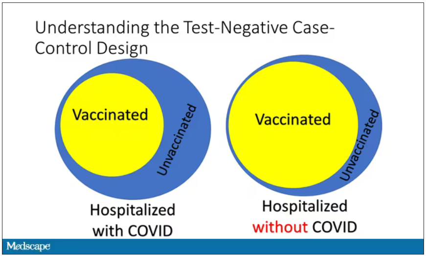
However, if you saw something like this, looking at all those patients with flu and other non-COVID illnesses, a lot more of them had been vaccinated for COVID. What that tells you is that we’re seeing fewer vaccinated people hospitalized with COVID than we would expect because we have this standardization from other respiratory infections. We expect this many vaccinated people because that’s how many vaccinated people there are who show up with flu. But in the COVID population, there are fewer, and that would suggest that the vaccines are effective. So that is the test-negative case-control design. You can do the same thing with ICU stays and death.
There are some assumptions here which you might already be thinking about. The most important one is that vaccination status is not associated with the risk for the disease. I always think of older people in this context. During the pandemic, at least in the United States, older people were much more likely to be vaccinated but were also much more likely to contract COVID and be hospitalized with COVID. The test-negative design actually accounts for this in some sense, because older people are also more likely to be hospitalized for things like flu and pneumonia. So there’s some control there.
But to the extent that older people are uniquely susceptible to COVID compared with other respiratory illnesses, that would bias your results to make the vaccines look worse. So the standard approach here is to adjust for these things. I think the CDC adjusted for age, sex, race, ethnicity, and a few other things to settle down and see how effective the vaccines were.
Let’s get to a worked example.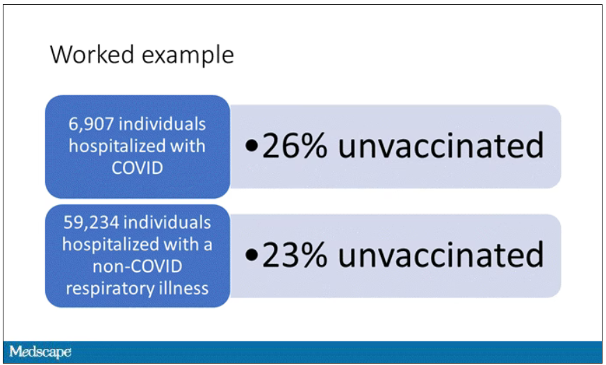
This is the actual data from the CDC paper. They had 6,907 individuals who were hospitalized with COVID, and 26% of them were unvaccinated. What’s the baseline rate that we would expect to be unvaccinated? A total of 59,234 individuals were hospitalized with a non-COVID respiratory illness, and 23% of them were unvaccinated. So you can see that there were more unvaccinated people than you would think in the COVID group. In other words, fewer vaccinated people, which suggests that the vaccine works to some degree because it’s keeping some people out of the hospital.
Now, 26% versus 23% is not a very impressive difference. But it gets more interesting when you break it down by the type of vaccine and how long ago the individual was vaccinated.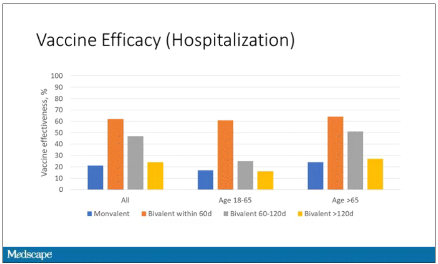
Let’s walk through the “all” group on this figure. What you can see is the calculated vaccine effectiveness. If you look at just the monovalent vaccine here, we see a 20% vaccine effectiveness. This means that you’re preventing 20% of hospitalizations basically due to COVID by people getting vaccinated. That’s okay but it’s certainly not anything to write home about. But we see much better vaccine effectiveness with the bivalent vaccine if it had been received within 60 days.
This compares people who received the bivalent vaccine within 60 days in the COVID group and the non-COVID group. The concern that the vaccine was given very recently affects both groups equally so it shouldn’t result in bias there. You see a step-off in vaccine effectiveness from 60 days, 60-120 days, and greater than 120 days. This is 4 months, and you’ve gone from 60% to 20%. When you break that down by age, you can see a similar pattern in the 18-to-65 group and potentially some more protection the greater than 65 age group.
Why is vaccine efficacy going down? The study doesn’t tell us, but we can hypothesize that this might be an immunologic effect – the antibodies or the protective T cells are waning over time. This could also reflect changes in the virus in the environment as the virus seeks to evade certain immune responses. But overall, this suggests that waiting a year between booster doses may leave you exposed for quite some time, although the take-home here is that bivalent vaccines in general are probably a good idea for the proportion of people who haven’t gotten them.
When we look at critical illness and death, the numbers look a little bit better.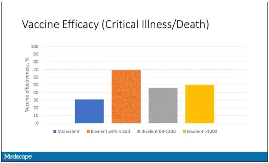
You can see that bivalent is better than monovalent – certainly pretty good if you’ve received it within 60 days. It does tend to wane a little bit, but not nearly as much. You’ve still got about 50% vaccine efficacy beyond 120 days when we’re looking at critical illness, which is stays in the ICU and death.
The overriding thing to think about when we think about vaccine policy is that the way you get immunized against COVID is either by vaccine or by getting infected with COVID, or both.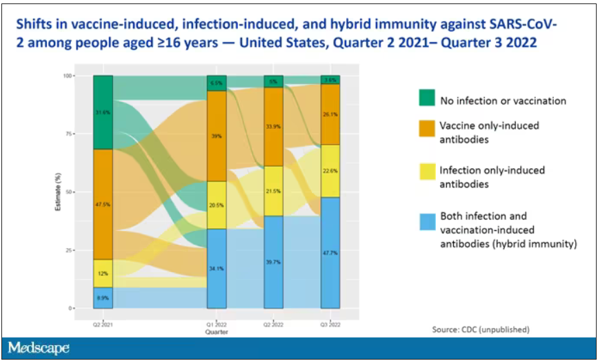
This really interesting graph from the CDC (although it’s updated only through quarter three of 2022) shows the proportion of Americans, based on routine lab tests, who have varying degrees of protection against COVID. What you can see is that, by quarter three of 2022, just 3.6% of people who had blood drawn at a commercial laboratory had no evidence of infection or vaccination. In other words, almost no one was totally naive. Then 26% of people had never been infected – they only have vaccine antibodies – plus 22% of people had only been infected but had never been vaccinated. And then 50% of people had both. So there’s a tremendous amount of existing immunity out there.
The really interesting question about future vaccination and future booster doses is, how does it work on the background of this pattern? The CDC study doesn’t tell us, and I don’t think they have the data to tell us the vaccine efficacy in these different groups. Is it more effective in people who have only had an infection, for example? Is it more effective in people who have only had vaccination versus people who had both, or people who have no protection whatsoever? Those are the really interesting questions that need to be answered going forward as vaccine policy gets developed in the future.
I hope this was a helpful primer on how the test-negative case-control design can answer questions that seem a little bit unanswerable.
F. Perry Wilson, MD, MSCE, is an associate professor of medicine and director of Yale’s Clinical and Translational Research Accelerator. He disclosed no relevant conflicts of interest.
A version of this article first appeared on Medscape.com.
The 30th-birthday gift that could save a life
This transcript has been edited for clarity.
Welcome to Impact Factor, your weekly dose of commentary on a new medical study. I’m Dr F. Perry Wilson of the Yale School of Medicine.
Milestone birthdays are always memorable – those ages when your life seems to fundamentally change somehow. Age 16: A license to drive. Age 18: You can vote to determine your own future and serve in the military. At 21, 3 years after adulthood, you are finally allowed to drink alcohol, for some reason. And then ... nothing much happens. At least until you turn 65 and become eligible for Medicare.
But imagine a future when turning 30 might be the biggest milestone birthday of all. Imagine a future when, at 30, you get your genome sequenced and doctors tell you what needs to be done to save your life.
That future may not be far off, as a new study shows us that
Getting your genome sequenced is a double-edged sword. Of course, there is the potential for substantial benefit; finding certain mutations allows for definitive therapy before it’s too late. That said, there are genetic diseases without a cure and without a treatment. Knowing about that destiny may do more harm than good.
Three conditions are described by the CDC as “Tier 1” conditions, genetic syndromes with a significant impact on life expectancy that also have definitive, effective therapies.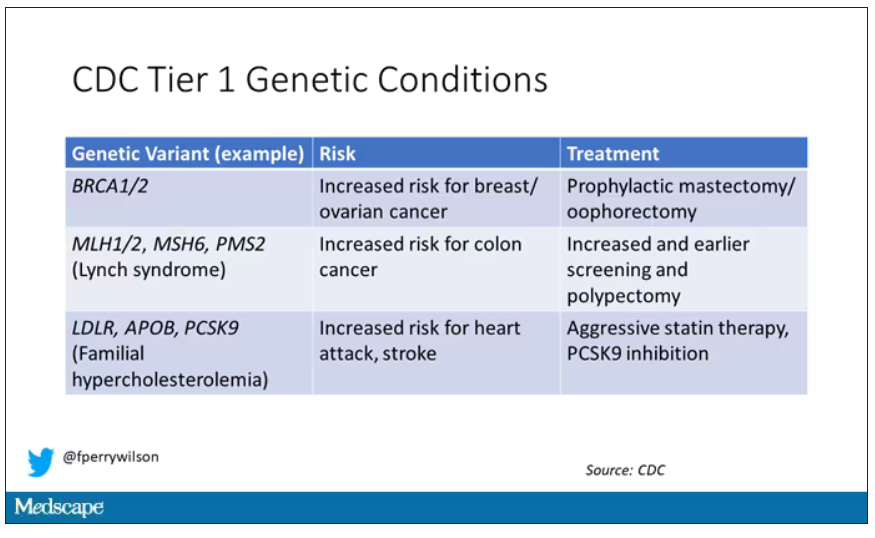
These include mutations like BRCA1/2, associated with a high risk for breast and ovarian cancer; mutations associated with Lynch syndrome, which confer an elevated risk for colon cancer; and mutations associated with familial hypercholesterolemia, which confer elevated risk for cardiovascular events.
In each of these cases, there is clear evidence that early intervention can save lives. Individuals at high risk for breast and ovarian cancer can get prophylactic mastectomy and salpingo-oophorectomy. Those with Lynch syndrome can get more frequent screening for colon cancer and polypectomy, and those with familial hypercholesterolemia can get aggressive lipid-lowering therapy.
I think most of us would probably want to know if we had one of these conditions. Most of us would use that information to take concrete steps to decrease our risk. But just because a rational person would choose to do something doesn’t mean it’s feasible. After all, we’re talking about tests and treatments that have significant costs.
In a recent issue of Annals of Internal Medicine, Josh Peterson and David Veenstra present a detailed accounting of the cost and benefit of a hypothetical nationwide, universal screening program for Tier 1 conditions. And in the end, it may actually be worth it.
Cost-benefit analyses work by comparing two independent policy choices: the status quo – in this case, a world in which some people get tested for these conditions, but generally only if they are at high risk based on strong family history; and an alternative policy – in this case, universal screening for these conditions starting at some age.
After that, it’s time to play the assumption game. Using the best available data, the authors estimated the percentage of the population that will have each condition, the percentage of those individuals who will definitively act on the information, and how effective those actions would be if taken.
The authors provide an example. First, they assume that the prevalence of mutations leading to a high risk for breast and ovarian cancer is around 0.7%, and that up to 40% of people who learn that they have one of these mutations would undergo prophylactic mastectomy, which would reduce the risk for breast cancer by around 94%. (I ran these numbers past my wife, a breast surgical oncologist, who agreed that they seem reasonable.)
Assumptions in place, it’s time to consider costs. The cost of the screening test itself: The authors use $250 as their average per-person cost. But we also have the cost of treatment – around $22,000 per person for a bilateral prophylactic mastectomy; the cost of statin therapy for those with familial hypercholesterolemia; or the cost of all of those colonoscopies for those with Lynch syndrome.
Finally, we assess quality of life. Obviously, living longer is generally considered better than living shorter, but marginal increases in life expectancy at the cost of quality of life might not be a rational choice.
You then churn these assumptions through a computer and see what comes out. How many dollars does it take to save one quality-adjusted life-year (QALY)? I’ll tell you right now that $50,000 per QALY used to be the unofficial standard for a “cost-effective” intervention in the United States. Researchers have more recently used $100,000 as that threshold.
Let’s look at some hard numbers.
If you screened 100,000 people at age 30 years, 1,500 would get news that something in their genetics was, more or less, a ticking time bomb. Some would choose to get definitive treatment and the authors estimate that the strategy would prevent 85 cases of cancer. You’d prevent nine heart attacks and five strokes by lowering cholesterol levels among those with familial hypercholesterolemia. Obviously, these aren’t huge numbers, but of course most people don’t have these hereditary risk factors. For your average 30-year-old, the genetic screening test will be completely uneventful, but for those 1,500 it will be life-changing, and potentially life-saving.
But is it worth it? The authors estimate that, at the midpoint of all their assumptions, the cost of this program would be $68,000 per QALY saved.
Of course, that depends on all those assumptions we talked about. Interestingly, the single factor that changes the cost-effectiveness the most in this analysis is the cost of the genetic test itself, which I guess makes sense, considering we’d be talking about testing a huge segment of the population. If the test cost $100 instead of $250, the cost per QALY would be $39,700 – well within the range that most policymakers would support. And given the rate at which the cost of genetic testing is decreasing, and the obvious economies of scale here, I think $100 per test is totally feasible.
The future will bring other changes as well. Right now, there are only three hereditary conditions designated as Tier 1 by the CDC. If conditions are added, that might also swing the calculation more heavily toward benefit.
This will represent a stark change from how we think about genetic testing currently, focusing on those whose pretest probability of an abnormal result is high due to family history or other risk factors. But for the 20-year-olds out there, I wouldn’t be surprised if your 30th birthday is a bit more significant than you have been anticipating.
Dr. Wilson is an associate professor of medicine and director of Yale’s Clinical and Translational Research Accelerator in New Haven, Conn. He disclosed no relevant conflicts of interest.
A version of this article first appeared on Medscape.com.
Surprising brain activity moments before death
This transcript has been edited for clarity.
Welcome to Impact Factor, your weekly dose of commentary on a new medical study. I’m Dr F. Perry Wilson of the Yale School of Medicine.
All the participants in the study I am going to tell you about this week died. And three of them died twice. But their deaths provide us with a fascinating window into the complex electrochemistry of the dying brain. What we might be looking at, indeed, is the physiologic correlate of the near-death experience.
The concept of the near-death experience is culturally ubiquitous. And though the content seems to track along culture lines – Western Christians are more likely to report seeing guardian angels, while Hindus are more likely to report seeing messengers of the god of death – certain factors seem to transcend culture: an out-of-body experience; a feeling of peace; and, of course, the light at the end of the tunnel.
As a materialist, I won’t discuss the possibility that these commonalities reflect some metaphysical structure to the afterlife. More likely, it seems to me, is that the commonalities result from the fact that the experience is mediated by our brains, and our brains, when dying, may be more alike than different.
We are talking about this study, appearing in the Proceedings of the National Academy of Sciences, by Jimo Borjigin and her team.
Dr. Borjigin studies the neural correlates of consciousness, perhaps one of the biggest questions in all of science today. To wit,
The study in question follows four unconscious patients –comatose patients, really – as life-sustaining support was withdrawn, up until the moment of death. Three had suffered severe anoxic brain injury in the setting of prolonged cardiac arrest. Though the heart was restarted, the brain damage was severe. The fourth had a large brain hemorrhage. All four patients were thus comatose and, though not brain-dead, unresponsive – with the lowest possible Glasgow Coma Scale score. No response to outside stimuli.
The families had made the decision to withdraw life support – to remove the breathing tube – but agreed to enroll their loved one in the study.
The team applied EEG leads to the head, EKG leads to the chest, and other monitoring equipment to observe the physiologic changes that occurred as the comatose and unresponsive patient died.
As the heart rhythm evolved from this: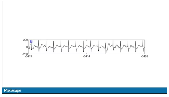
To this: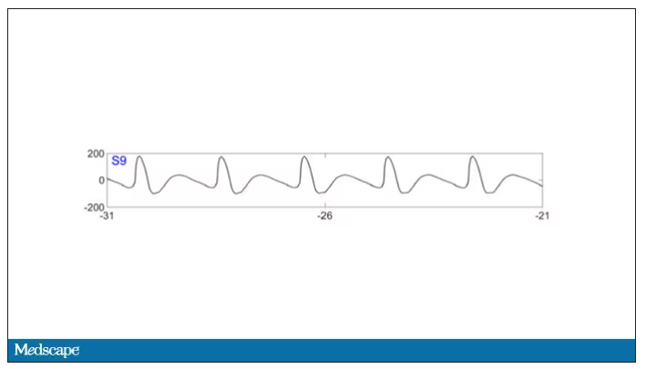
And eventually stopped.
But this is a study about the brain, not the heart.
Prior to the withdrawal of life support, the brain electrical signals looked like this: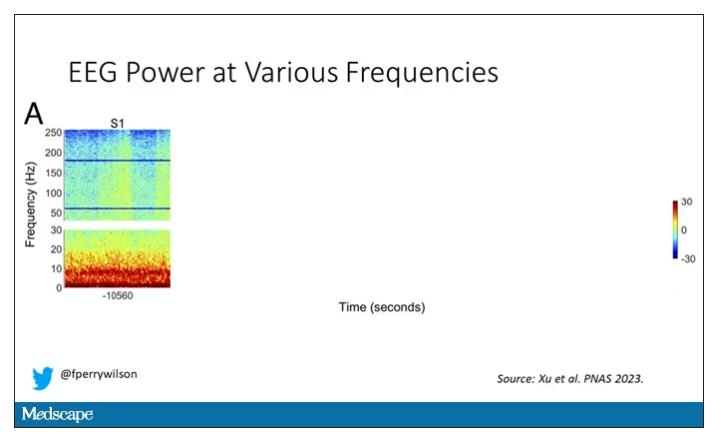
What you see is the EEG power at various frequencies, with red being higher. All the red was down at the low frequencies. Consciousness, at least as we understand it, is a higher-frequency phenomenon.
Right after the breathing tube was removed, the power didn’t change too much, but you can see some increased activity at the higher frequencies.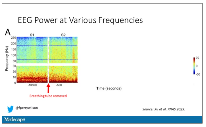
But in two of the four patients, something really surprising happened. Watch what happens as the brain gets closer and closer to death.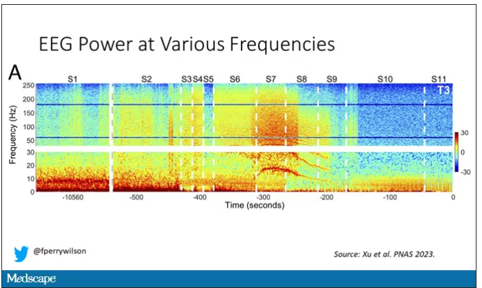
Here, about 300 seconds before death, there was a power surge at the high gamma frequencies.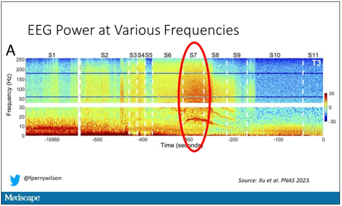
This spike in power occurred in the somatosensory cortex and the dorsolateral prefrontal cortex, areas that are associated with conscious experience. It seems that this patient, 5 minutes before death, was experiencing something.
But I know what you’re thinking. This is a brain that is not receiving oxygen. Cells are going to become disordered quickly and start firing randomly – a last gasp, so to speak, before the end. Meaningless noise.
But connectivity mapping tells a different story. The signals seem to have structure.
Those high-frequency power surges increased connectivity in the posterior cortical “hot zone,” an area of the brain many researchers feel is necessary for conscious perception. This figure is not a map of raw brain electrical output like the one I showed before, but of coherence between brain regions in the consciousness hot zone. Those red areas indicate cross-talk – not the disordered scream of dying neurons, but a last set of messages passing back and forth from the parietal and posterior temporal lobes.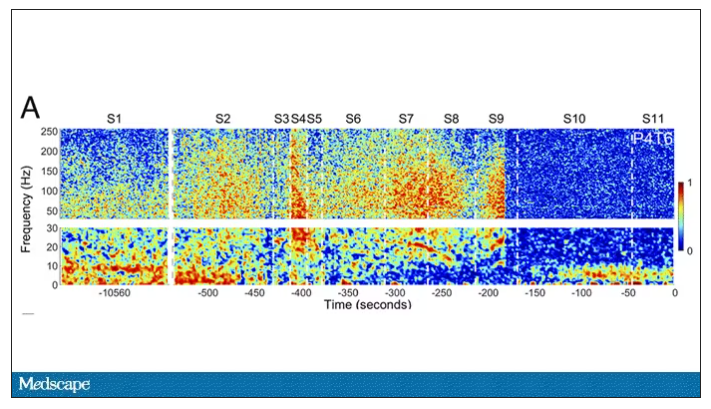
In fact, the electrical patterns of the brains in these patients looked very similar to the patterns seen in dreaming humans, as well as in patients with epilepsy who report sensations of out-of-body experiences.
It’s critical to realize two things here. First, these signals of consciousness were not present before life support was withdrawn. These comatose patients had minimal brain activity; there was no evidence that they were experiencing anything before the process of dying began. These brains are behaving fundamentally differently near death.
But second, we must realize that, although the brains of these individuals, in their last moments, appeared to be acting in a way that conscious brains act, we have no way of knowing if the patients were truly having a conscious experience. As I said, all the patients in the study died. Short of those metaphysics I alluded to earlier, we will have no way to ask them how they experienced their final moments.
Let’s be clear: This study doesn’t answer the question of what happens when we die. It says nothing about life after death or the existence or persistence of the soul. But what it does do is shed light on an incredibly difficult problem in neuroscience: the problem of consciousness. And as studies like this move forward, we may discover that the root of consciousness comes not from the breath of God or the energy of a living universe, but from very specific parts of the very complicated machine that is the brain, acting together to produce something transcendent. And to me, that is no less sublime.
Dr. Wilson is an associate professor of medicine and director of Yale’s Clinical and Translational Research Accelerator, Yale University, New Haven, Conn. His science communication work can be found in the Huffington Post, on NPR, and on Medscape. He tweets @fperrywilson and his new book, How Medicine Works and When It Doesn’t, is available now. Dr. Wilson has disclosed no relevant financial relationships.
Autism: Is it in the water?
This transcript has been edited for clarity.
Few diseases have stymied explanation like autism spectrum disorder (ASD). We know that the prevalence has been increasing dramatically, but we aren’t quite sure whether that is because of more screening and awareness or more fundamental changes. We know that much of the risk appears to be genetic, but there may be 1,000 genes involved in the syndrome. We know that certain environmental exposures, like pollution, might increase the risk – perhaps on a susceptible genetic background – but we’re not really sure which exposures are most harmful.
So, the search continues, across all domains of inquiry from cell culture to large epidemiologic analyses. And this week, a new player enters the field, and, as they say, it’s something in the water.
We’re talking about this paper, by Zeyan Liew and colleagues, appearing in JAMA Pediatrics.
Using the incredibly robust health data infrastructure in Denmark, the researchers were able to identify 8,842 children born between 2000 and 2013 with ASD and matched each one to five control kids of the same sex and age without autism.
They then mapped the location the mothers of these kids lived while they were pregnant – down to 5 meters resolution, actually – to groundwater lithium levels.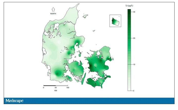
Once that was done, the analysis was straightforward. Would moms who were pregnant in areas with higher groundwater lithium levels be more likely to have kids with ASD?
The results show a rather steady and consistent association between higher lithium levels in groundwater and the prevalence of ASD in children.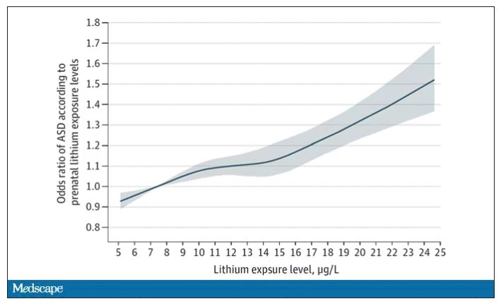
We’re not talking huge numbers, but moms who lived in the areas of the highest quartile of lithium were about 46% more likely to have a child with ASD. That’s a relative risk, of course – this would be like an increase from 1 in 100 kids to 1.5 in 100 kids. But still, it’s intriguing.
But the case is far from closed here.
Groundwater concentration of lithium and the amount of lithium a pregnant mother ingests are not the same thing. It does turn out that virtually all drinking water in Denmark comes from groundwater sources – but not all lithium comes from drinking water. There are plenty of dietary sources of lithium as well. And, of course, there is medical lithium, but we’ll get to that in a second.
First, let’s talk about those lithium measurements. They were taken in 2013 – after all these kids were born. The authors acknowledge this limitation but show a high correlation between measured levels in 2013 and earlier measured levels from prior studies, suggesting that lithium levels in a given area are quite constant over time. That’s great – but if lithium levels are constant over time, this study does nothing to shed light on why autism diagnoses seem to be increasing.
Let’s put some numbers to the lithium concentrations the authors examined. The average was about 12 mcg/L.
As a reminder, a standard therapeutic dose of lithium used for bipolar disorder is like 600 mg. That means you’d need to drink more than 2,500 of those 5-gallon jugs that sit on your water cooler, per day, to approximate the dose you’d get from a lithium tablet. Of course, small doses can still cause toxicity – but I wanted to put this in perspective.
Also, we have some data on pregnant women who take medical lithium. An analysis of nine studies showed that first-trimester lithium use may be associated with congenital malformations – particularly some specific heart malformations – and some birth complications. But three of four separate studies looking at longer-term neurodevelopmental outcomes did not find any effect on development, attainment of milestones, or IQ. One study of 15 kids exposed to medical lithium in utero did note minor neurologic dysfunction in one child and a low verbal IQ in another – but that’s a very small study.
Of course, lithium levels vary around the world as well. The U.S. Geological Survey examined lithium content in groundwater in the United States, as you can see here.
Our numbers are pretty similar to Denmark’s – in the 0-60 range. But an area in the Argentine Andes has levels as high as 1,600 mcg/L. A study of 194 babies from that area found higher lithium exposure was associated with lower fetal size, but I haven’t seen follow-up on neurodevelopmental outcomes.
The point is that there is a lot of variability here. It would be really interesting to map groundwater lithium levels to autism rates around the world. As a teaser, I will point out that, if you look at worldwide autism rates, you may be able to convince yourself that they are higher in more arid climates, and arid climates tend to have more groundwater lithium. But I’m really reaching here. More work needs to be done.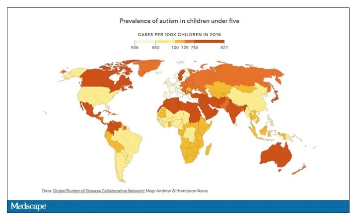
And I hope it is done quickly. Lithium is in the midst of becoming a very important commodity thanks to the shift to electric vehicles. While we can hope that recycling will claim most of those batteries at the end of their life, some will escape reclamation and potentially put more lithium into the drinking water. I’d like to know how risky that is before it happens.
F. Perry Wilson, MD, MSCE, is an associate professor of medicine and director of Yale’s Clinical and Translational Research Accelerator. He has disclosed no relevant financial relationships. His science communication work can be found in the Huffington Post, on NPR, and here on Medscape. He tweets @fperrywilson and his new book, “How Medicine Works and When It Doesn’t”, is available now.
A version of this article originally appeared on Medscape.com.
‘Excess’ deaths surging, but why?
This transcript has been edited for clarity.
“Excess deaths.” You’ve heard the phrase countless times by now. It is one of the myriad of previously esoteric epidemiology terms that the pandemic brought squarely into the zeitgeist.
As a sort of standard candle of the performance of a state or a region or a country in terms of health care, it has a lot of utility – if for nothing more than Monday-morning quarterbacking. But this week, I want to dig in on the concept a bit because, according to a new study, the excess death gap between the United States and Western Europe has never been higher.
You might imagine that the best way to figure this out is for some group of intelligent people to review each death and decide, somehow, whether it was expected or not. But aside from being impractical, this would end up being somewhat subjective. That older person who died from pneumonia – was that an expected death? Could it have been avoided?
Rather, the calculation of excess mortality relies on large numbers and statistical inference to compare an expected number of deaths with those that are observed.
The difference is excess mortality, even if you can never be sure whether any particular death was expected or not.
As always, however, the devil is in the details. What data do you use to define the expected number of deaths?
There are options here. Probably the most straightforward analysis uses past data from the country of interest. You look at annual deaths over some historical period of time and compare those numbers with the rates today. Two issues need to be accounted for here: population growth – a larger population will have more deaths, so you need to adjust the historical population with current levels, and demographic shifts – an older or more male population will have more deaths, so you need to adjust for that as well.
But provided you take care of those factors, you can estimate fairly well how many deaths you can expect to see in any given period of time.
Still, you should see right away that excess mortality is a relative concept. If you think that, just perhaps, the United States has some systematic failure to deliver care that has been stable and persistent over time, you wouldn’t capture that failing in an excess mortality calculation that uses U.S. historical data as the baseline.
The best way to get around that is to use data from other countries, and that’s just what this article – a rare single-author piece by Patrick Heuveline – does, calculating excess deaths in the United States by standardizing our mortality rates to the five largest Western European countries: the United Kingdom, France, Germany, Italy, and Spain.
Controlling for the differences in the demographics of that European population, here is the expected number of deaths in the United States over the past 5 years.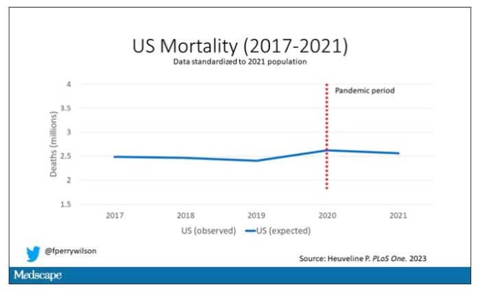
Note that there is a small uptick in expected deaths in 2020, reflecting the pandemic, which returns to baseline levels by 2021. This is because that’s what happened in Europe; by 2021, the excess mortality due to COVID-19 was quite low.
Here are the actual deaths in the US during that time.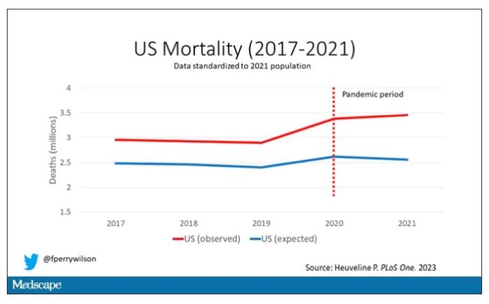
Highlighted here in green, then, is the excess mortality over time in the United States.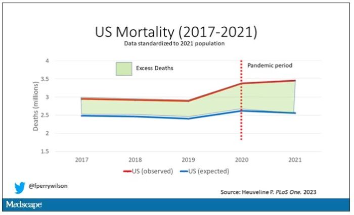
There are some fascinating and concerning findings here.
First of all, you can see that even before the pandemic, the United States has an excess mortality problem. This is not entirely a surprise; we’ve known that so-called “deaths of despair,” those due to alcohol abuse, drug overdoses, and suicide, are at an all-time high and tend to affect a “prime of life” population that would not otherwise be expected to die. In fact, fully 50% of the excess deaths in the United States occur in those between ages 15 and 64.
Excess deaths are also a concerning percentage of total deaths. In 2017, 17% of total deaths in the United States could be considered “excess.” In 2021, that number had doubled to 35%. Nearly 900,000 individuals in the United States died in 2021 who perhaps didn’t need to.
The obvious culprit to blame here is COVID, but COVID-associated excess deaths only explain about 50% of the excess we see in 2021. The rest reflect something even more concerning: a worsening of the failures of the past, perhaps exacerbated by the pandemic but not due to the virus itself.
Of course, we started this discussion acknowledging that the calculation of excess mortality is exquisitely dependent on how you model the expected number of deaths, and I’m sure some will take issue with the use of European numbers when applied to Americans. After all, Europe has, by and large, a robust public health service, socialized medicine, and healthcare that does not run the risk of bankrupting its citizens. How can we compare our outcomes to a place like that?
How indeed.
F. Perry Wilson, MD, MSCE, is an associate professor of medicine and director of Yale University’s Clinical and Translational Research Accelerator in New Haven,Conn. He reported no relevant conflicts of interest.
A version of this article originally appeared on Medscape.com.
Celebrity death finally solved – with locks of hair
This transcript has been edited for clarity.
I’m going to open this week with a case.
A 56-year-old musician presents with diffuse abdominal pain, cramping, and jaundice. His medical history is notable for years of diffuse abdominal complaints, characterized by disabling bouts of diarrhea.
In addition to the jaundice, this acute illness was accompanied by fever as well as diffuse edema and ascites. The patient underwent several abdominal paracenteses to drain excess fluid. One consulting physician administered alcohol to relieve pain, to little avail.
The patient succumbed to his illness. An autopsy showed diffuse liver injury, as well as papillary necrosis of the kidneys. Notably, the nerves of his auditory canal were noted to be thickened, along with the bony part of the skull, consistent with Paget disease of the bone and explaining, potentially, why the talented musician had gone deaf at such a young age.
An interesting note on social history: The patient had apparently developed some feelings for the niece of that doctor who prescribed alcohol. Her name was Therese, perhaps mistranscribed as Elise, and it seems that he may have written this song for her.

We’re talking about this paper in Current Biology, by Tristan Begg and colleagues, which gives us a look into the very genome of what some would argue is the world’s greatest composer.
The ability to extract DNA from older specimens has transformed the fields of anthropology, archaeology, and history, and now, perhaps, musicology as well.
The researchers identified eight locks of hair in private and public collections, all attributed to the maestro.

Four of the samples had an intact chain of custody from the time the hair was cut. DNA sequencing on these four and an additional one of the eight locks came from the same individual, a male of European heritage.
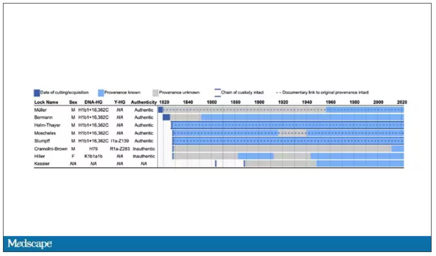
The three locks with less documentation came from three other unrelated individuals. Interestingly, analysis of one of those hair samples – the so-called Hiller Lock – had shown high levels of lead, leading historians to speculate that lead poisoning could account for some of Beethoven’s symptoms.

DNA analysis of that hair reveals it to have come from a woman likely of North African, Middle Eastern, or Jewish ancestry. We can no longer presume that plumbism was involved in Beethoven’s death. Beethoven’s ancestry turns out to be less exotic and maps quite well to ethnic German populations today.
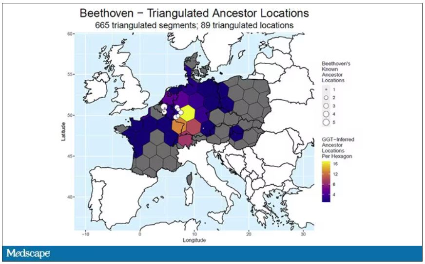
In fact, there are van Beethovens alive as we speak, primarily in Belgium. Genealogic records suggest that these van Beethovens share a common ancestor with the virtuoso composer, a man by the name of Aert van Beethoven.
But the DNA reveals a scandal.
The Y-chromosome that Beethoven inherited was not Aert van Beethoven’s. Questions of Beethoven’s paternity have been raised before, but this evidence strongly suggests an extramarital paternity event, at least in the generations preceding his birth. That’s right – Beethoven may not have been a Beethoven.
With five locks now essentially certain to have come from Beethoven himself, the authors could use DNA analysis to try to explain three significant health problems he experienced throughout his life and death: his hearing loss, his terrible gastrointestinal issues, and his liver failure.
Let’s start with the most disappointing results, explanations for his hearing loss. No genetic cause was forthcoming, though the authors note that they have little to go on in regard to the genetic risk for otosclerosis, to which his hearing loss has often been attributed. Lead poisoning is, of course, possible here, though this report focuses only on genetics – there was no testing for lead – and as I mentioned, the lock that was strongly lead-positive in prior studies is almost certainly inauthentic.
What about his lifelong GI complaints? Some have suggested celiac disease or lactose intolerance as explanations. These can essentially be ruled out by the genetic analysis, which shows no risk alleles for celiac disease and the presence of the lactase-persistence gene which confers the ability to metabolize lactose throughout one’s life. IBS is harder to assess genetically, but for what it’s worth, he scored quite low on a polygenic risk score for the condition, in just the 9th percentile of risk. We should probably be looking elsewhere to explain the GI distress.
The genetic information bore much more fruit in regard to his liver disease. Remember that Beethoven’s autopsy showed cirrhosis. His polygenic risk score for liver cirrhosis puts him in the 96th percentile of risk. He was also heterozygous for two variants that can cause hereditary hemochromatosis. The risk for cirrhosis among those with these variants is increased by the use of alcohol. And historical accounts are quite clear that Beethoven consumed more than his share.
But it wasn’t just Beethoven’s DNA in these hair follicles. Analysis of a follicle from later in his life revealed the unmistakable presence of hepatitis B virus. Endemic in Europe at the time, this was a common cause of liver failure and is likely to have contributed to, if not directly caused, Beethoven’s demise.
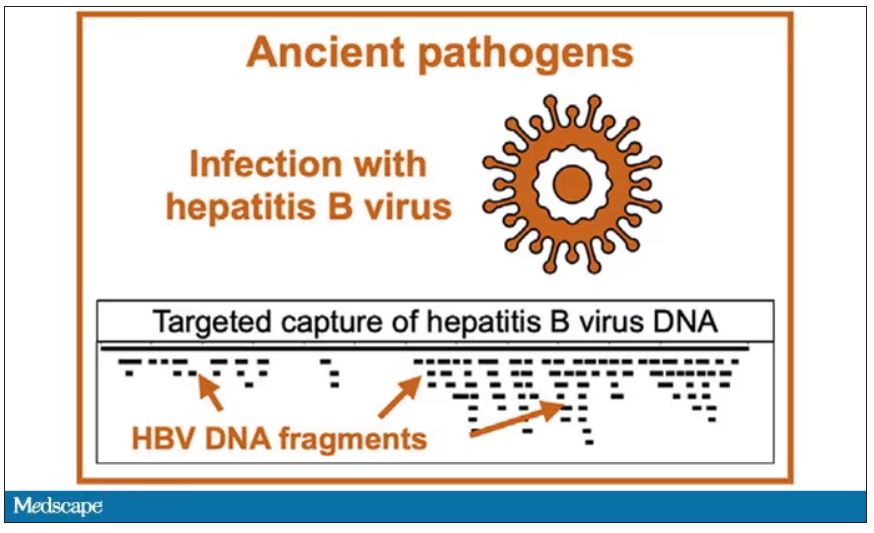
It’s hard to read these results and not marvel at the fact that, two centuries after his death, our fascination with Beethoven has led us to probe every corner of his life – his letters, his writings, his medical records, and now his very DNA. What are we actually looking for? Is it relevant to us today what caused his hearing loss? His stomach troubles? Even his death? Will it help any patients in the future? I propose that what we are actually trying to understand is something ineffable: Genius of magnitude that is rarely seen in one or many lifetimes. And our scientific tools, as sharp as they may have become, are still far too blunt to probe the depths of that transcendence.
In any case, friends, no more of these sounds. Let us sing more cheerful songs, more full of joy.
For Medscape, I’m Perry Wilson.
Dr. Wilson is associate professor, department of medicine, and director, Clinical and Translational Research Accelerator, at Yale University, New Haven, Conn. He reported no conflicts of interest.
A version of this article first appeared on Medscape.com.
This transcript has been edited for clarity.
I’m going to open this week with a case.
A 56-year-old musician presents with diffuse abdominal pain, cramping, and jaundice. His medical history is notable for years of diffuse abdominal complaints, characterized by disabling bouts of diarrhea.
In addition to the jaundice, this acute illness was accompanied by fever as well as diffuse edema and ascites. The patient underwent several abdominal paracenteses to drain excess fluid. One consulting physician administered alcohol to relieve pain, to little avail.
The patient succumbed to his illness. An autopsy showed diffuse liver injury, as well as papillary necrosis of the kidneys. Notably, the nerves of his auditory canal were noted to be thickened, along with the bony part of the skull, consistent with Paget disease of the bone and explaining, potentially, why the talented musician had gone deaf at such a young age.
An interesting note on social history: The patient had apparently developed some feelings for the niece of that doctor who prescribed alcohol. Her name was Therese, perhaps mistranscribed as Elise, and it seems that he may have written this song for her.
We’re talking about this paper in Current Biology, by Tristan Begg and colleagues, which gives us a look into the very genome of what some would argue is the world’s greatest composer.
The ability to extract DNA from older specimens has transformed the fields of anthropology, archaeology, and history, and now, perhaps, musicology as well.
The researchers identified eight locks of hair in private and public collections, all attributed to the maestro.
Four of the samples had an intact chain of custody from the time the hair was cut. DNA sequencing on these four and an additional one of the eight locks came from the same individual, a male of European heritage.
The three locks with less documentation came from three other unrelated individuals. Interestingly, analysis of one of those hair samples – the so-called Hiller Lock – had shown high levels of lead, leading historians to speculate that lead poisoning could account for some of Beethoven’s symptoms.
DNA analysis of that hair reveals it to have come from a woman likely of North African, Middle Eastern, or Jewish ancestry. We can no longer presume that plumbism was involved in Beethoven’s death. Beethoven’s ancestry turns out to be less exotic and maps quite well to ethnic German populations today.
In fact, there are van Beethovens alive as we speak, primarily in Belgium. Genealogic records suggest that these van Beethovens share a common ancestor with the virtuoso composer, a man by the name of Aert van Beethoven.
But the DNA reveals a scandal.
The Y-chromosome that Beethoven inherited was not Aert van Beethoven’s. Questions of Beethoven’s paternity have been raised before, but this evidence strongly suggests an extramarital paternity event, at least in the generations preceding his birth. That’s right – Beethoven may not have been a Beethoven.
With five locks now essentially certain to have come from Beethoven himself, the authors could use DNA analysis to try to explain three significant health problems he experienced throughout his life and death: his hearing loss, his terrible gastrointestinal issues, and his liver failure.
Let’s start with the most disappointing results, explanations for his hearing loss. No genetic cause was forthcoming, though the authors note that they have little to go on in regard to the genetic risk for otosclerosis, to which his hearing loss has often been attributed. Lead poisoning is, of course, possible here, though this report focuses only on genetics – there was no testing for lead – and as I mentioned, the lock that was strongly lead-positive in prior studies is almost certainly inauthentic.
What about his lifelong GI complaints? Some have suggested celiac disease or lactose intolerance as explanations. These can essentially be ruled out by the genetic analysis, which shows no risk alleles for celiac disease and the presence of the lactase-persistence gene which confers the ability to metabolize lactose throughout one’s life. IBS is harder to assess genetically, but for what it’s worth, he scored quite low on a polygenic risk score for the condition, in just the 9th percentile of risk. We should probably be looking elsewhere to explain the GI distress.
The genetic information bore much more fruit in regard to his liver disease. Remember that Beethoven’s autopsy showed cirrhosis. His polygenic risk score for liver cirrhosis puts him in the 96th percentile of risk. He was also heterozygous for two variants that can cause hereditary hemochromatosis. The risk for cirrhosis among those with these variants is increased by the use of alcohol. And historical accounts are quite clear that Beethoven consumed more than his share.
But it wasn’t just Beethoven’s DNA in these hair follicles. Analysis of a follicle from later in his life revealed the unmistakable presence of hepatitis B virus. Endemic in Europe at the time, this was a common cause of liver failure and is likely to have contributed to, if not directly caused, Beethoven’s demise.
It’s hard to read these results and not marvel at the fact that, two centuries after his death, our fascination with Beethoven has led us to probe every corner of his life – his letters, his writings, his medical records, and now his very DNA. What are we actually looking for? Is it relevant to us today what caused his hearing loss? His stomach troubles? Even his death? Will it help any patients in the future? I propose that what we are actually trying to understand is something ineffable: Genius of magnitude that is rarely seen in one or many lifetimes. And our scientific tools, as sharp as they may have become, are still far too blunt to probe the depths of that transcendence.
In any case, friends, no more of these sounds. Let us sing more cheerful songs, more full of joy.
For Medscape, I’m Perry Wilson.
Dr. Wilson is associate professor, department of medicine, and director, Clinical and Translational Research Accelerator, at Yale University, New Haven, Conn. He reported no conflicts of interest.
A version of this article first appeared on Medscape.com.
Joint effort: CBD not just innocent bystander in weed
This transcript has been edited for clarity.
Welcome to Impact Factor, your weekly dose of commentary on a new medical study. I’m Dr. F. Perry Wilson of the Yale School of Medicine.
I visited a legal cannabis dispensary in Massachusetts a few years ago, mostly to see what the hype was about. There I was, knowing basically nothing about pot, as the gentle stoner behind the counter explained to me the differences between the various strains. Acapulco Gold is buoyant and energizing; Purple Kush is sleepy, relaxed, dissociative. Here’s a strain that makes you feel nostalgic; here’s one that helps you focus. It was as complicated and as oddly specific as a fancy wine tasting – and, I had a feeling, about as reliable.
It’s a plant, after all, and though delta-9-tetrahydrocannabinol (THC) is the chemical responsible for its euphoric effects, it is far from the only substance in there.
The second most important compound in cannabis is cannabidiol, and most people will tell you that CBD is the gentle yin to THC’s paranoiac yang. Hence your local ganja barista reminding you that, if you don›t want all those anxiety-inducing side effects of THC, grab a strain with a nice CBD balance.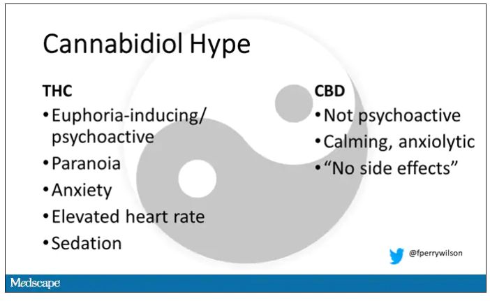
But is it true? A new study appearing in JAMA Network Open suggests, in fact, that it’s quite the opposite. This study is from Austin Zamarripa and colleagues, who clearly sit at the researcher cool kids table.
Eighteen adults who had abstained from marijuana use for at least a month participated in this trial (which is way more fun than anything we do in my lab at Yale). In random order, separated by at least a week, they ate some special brownies.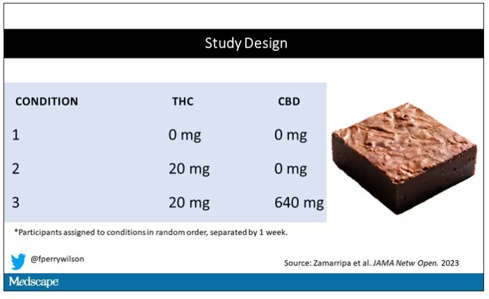
Condition one was a control brownie, condition two was a brownie containing 20 mg of THC, and condition three was a brownie containing 20 mg of THC and 640 mg of CBD. Participants were assigned each condition in random order, separated by at least a week.
A side note on doses for those of you who, like me, are not totally weed literate. A dose of 20 mg of THC is about a third of what you might find in a typical joint these days (though it’s about double the THC content of a joint in the ‘70s – I believe the technical term is “doobie”). And 640 mg of CBD is a decent dose, as 5 mg per kilogram is what some folks start with to achieve therapeutic effects.
Both THC and CBD interact with the cytochrome p450 system in the liver. This matters when you’re ingesting them instead of smoking them because you have first-pass metabolism to contend with. And, because of that p450 inhibition, it’s possible that CBD might actually increase the amount of THC that gets into your bloodstream from the brownie, or gummy, or pizza sauce, or whatever.
Let’s get to the results, starting with blood THC concentration. It’s not subtle. With CBD on board the THC concentration rises higher faster, with roughly double the area under the curve.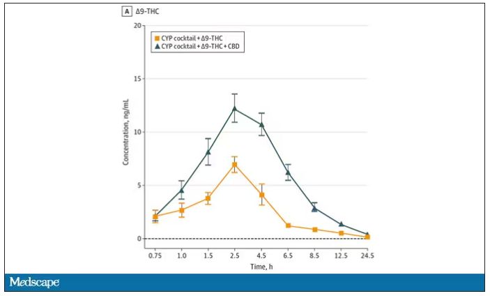
And, unsurprisingly, the subjective experience correlated with those higher levels. Individuals rated the “drug effect” higher with the combo. But, interestingly, the “pleasant” drug effect didn’t change much, while the unpleasant effects were substantially higher. No mitigation of THC anxiety here – quite the opposite. CBD made the anxiety worse.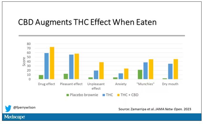
Cognitive effects were equally profound. Scores on a digit symbol substitution test and a paced serial addition task were all substantially worse when CBD was mixed with THC.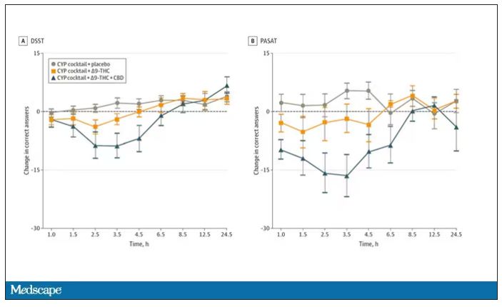
And for those of you who want some more objective measures, check out the heart rate. Despite the purported “calming” nature of CBD, heart rates were way higher when individuals were exposed to both chemicals.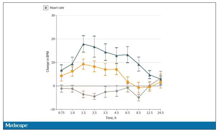
The picture here is quite clear, though the mechanism is not. At least when talking edibles, CBD enhances the effects of THC, and not necessarily for the better. It may be that CBD is competing with some of the proteins that metabolize THC, thus prolonging its effects. CBD may also directly inhibit those enzymes. But whatever the case, I think we can safely say the myth that CBD makes the effects of THC more mild or more tolerable is busted.
F. Perry Wilson, MD, MSCE, is an associate professor of medicine and director of Yale University’s Clinical and Translational Research Accelerator in New Haven, Conn.
A version of this article first appeared on Medscape.com.
A new (old) drug joins the COVID fray, and guess what? It works
This transcript has been edited for clarity.
Welcome to Impact Factor, your weekly dose of commentary on a new medical study. I’m Dr F. Perry Wilson of the Yale School of Medicine.
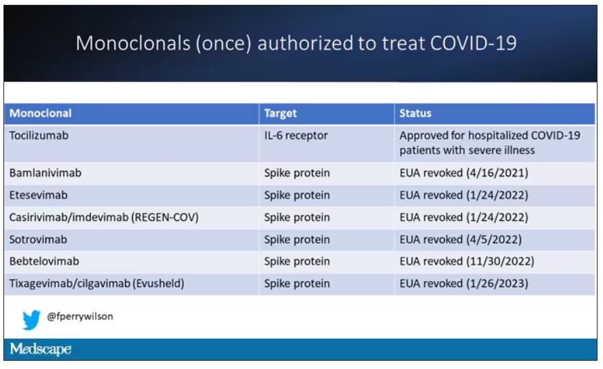
At this point, with the monoclonals found to be essentially useless, we are left with remdesivir with its modest efficacy and Paxlovid, which, for some reason, people don’t seem to be taking.
Part of the reason the monoclonals have failed lately is because of their specificity; they are homogeneous antibodies targeted toward a very specific epitope that may change from variant to variant. We need a broader therapeutic, one that has activity across all variants — maybe even one that has activity against all viruses? We’ve got one. Interferon.
The first mention of interferon as a potential COVID therapy was at the very start of the pandemic, so I’m sort of surprised that the first large, randomized trial is only being reported now in the New England Journal of Medicine.
Before we dig into the results, let’s talk mechanism. This is a trial of interferon-lambda, also known as interleukin-29.
The lambda interferons were only discovered in 2003. They differ from the more familiar interferons only in their cellular receptors; the downstream effects seem quite similar. As opposed to the cellular receptors for interferon alfa, which are widely expressed, the receptors for lambda are restricted to epithelial tissues. This makes it a good choice as a COVID treatment, since the virus also preferentially targets those epithelial cells.
In this study, 1,951 participants from Brazil and Canada, but mostly Brazil, with new COVID infections who were not yet hospitalized were randomized to receive 180 mcg of interferon lambda or placebo.
This was a relatively current COVID trial, as you can see from the participant characteristics. The majority had been vaccinated, and nearly half of the infections were during the Omicron phase of the pandemic.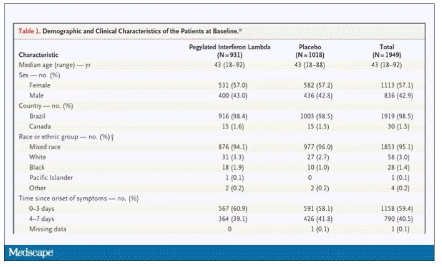
If you just want to cut to the chase, interferon worked.
The primary outcome – hospitalization or a prolonged emergency room visit for COVID – was 50% lower in the interferon group.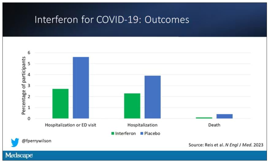
Key secondary outcomes, including death from COVID, were lower in the interferon group as well. These effects persisted across most of the subgroups I was looking out for.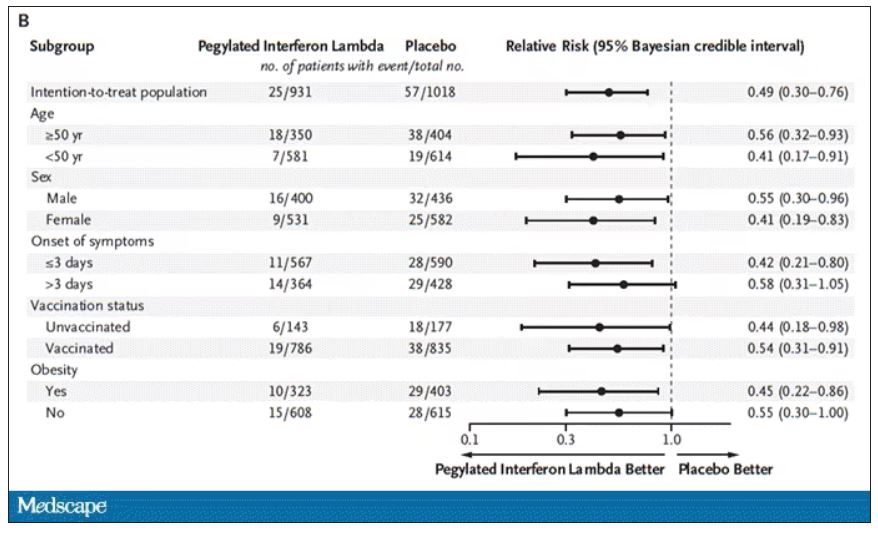
Interferon seemed to help those who were already vaccinated and those who were unvaccinated. There’s a hint that it works better within the first few days of symptoms, which isn’t surprising; we’ve seen this for many of the therapeutics, including Paxlovid. Time is of the essence. Encouragingly, the effect was a bit more pronounced among those infected with Omicron.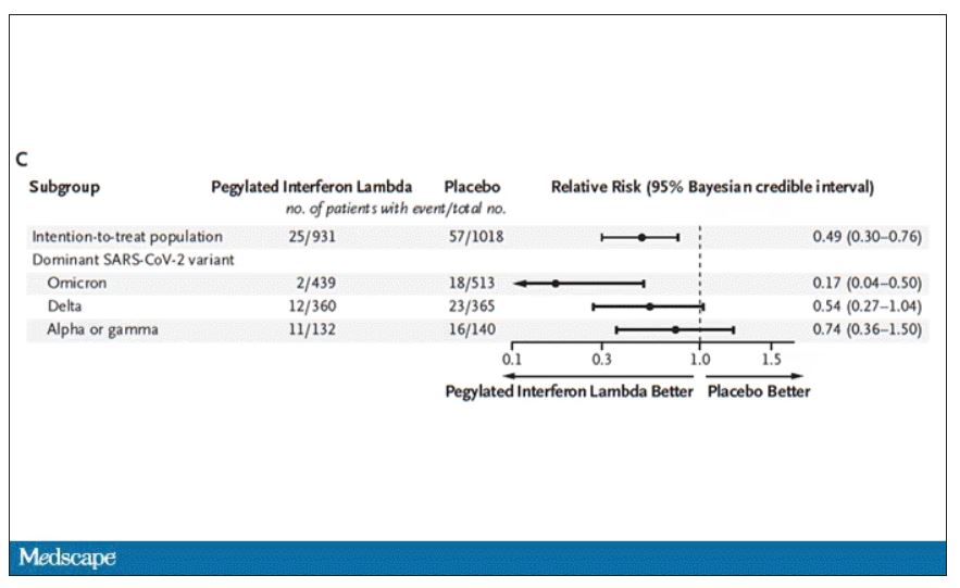
Of course, if you have any experience with interferon, you know that the side effects can be pretty rough. In the bad old days when we treated hepatitis C infection with interferon, patients would get their injections on Friday in anticipation of being essentially out of commission with flu-like symptoms through the weekend. But we don’t see much evidence of adverse events in this trial, maybe due to the greater specificity of interferon lambda.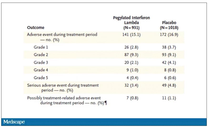
Putting it all together, the state of play for interferons in COVID may be changing. To date, the FDA has not recommended the use of interferon alfa or -beta for COVID-19, citing some data that they are ineffective or even harmful in hospitalized patients with COVID. Interferon lambda is not FDA approved and thus not even available in the United States. But the reason it has not been approved is that there has not been a large, well-conducted interferon lambda trial. Now there is. Will this study be enough to prompt an emergency use authorization? The elephant in the room, of course, is Paxlovid, which at this point has a longer safety track record and, importantly, is oral. I’d love to see a head-to-head trial. Short of that, I tend to be in favor of having more options on the table.
Dr. Perry Wilson is associate professor, department of medicine, and director, Clinical and Translational Research Accelerator, at Yale University, New Haven, Conn. He disclosed no relevant conflicts of interest.
A version of this article first appeared on Medscape.com.
This transcript has been edited for clarity.
Welcome to Impact Factor, your weekly dose of commentary on a new medical study. I’m Dr F. Perry Wilson of the Yale School of Medicine.
At this point, with the monoclonals found to be essentially useless, we are left with remdesivir with its modest efficacy and Paxlovid, which, for some reason, people don’t seem to be taking.
Part of the reason the monoclonals have failed lately is because of their specificity; they are homogeneous antibodies targeted toward a very specific epitope that may change from variant to variant. We need a broader therapeutic, one that has activity across all variants — maybe even one that has activity against all viruses? We’ve got one. Interferon.
The first mention of interferon as a potential COVID therapy was at the very start of the pandemic, so I’m sort of surprised that the first large, randomized trial is only being reported now in the New England Journal of Medicine.
Before we dig into the results, let’s talk mechanism. This is a trial of interferon-lambda, also known as interleukin-29.
The lambda interferons were only discovered in 2003. They differ from the more familiar interferons only in their cellular receptors; the downstream effects seem quite similar. As opposed to the cellular receptors for interferon alfa, which are widely expressed, the receptors for lambda are restricted to epithelial tissues. This makes it a good choice as a COVID treatment, since the virus also preferentially targets those epithelial cells.
In this study, 1,951 participants from Brazil and Canada, but mostly Brazil, with new COVID infections who were not yet hospitalized were randomized to receive 180 mcg of interferon lambda or placebo.
This was a relatively current COVID trial, as you can see from the participant characteristics. The majority had been vaccinated, and nearly half of the infections were during the Omicron phase of the pandemic.
If you just want to cut to the chase, interferon worked.
The primary outcome – hospitalization or a prolonged emergency room visit for COVID – was 50% lower in the interferon group.
Key secondary outcomes, including death from COVID, were lower in the interferon group as well. These effects persisted across most of the subgroups I was looking out for.
Interferon seemed to help those who were already vaccinated and those who were unvaccinated. There’s a hint that it works better within the first few days of symptoms, which isn’t surprising; we’ve seen this for many of the therapeutics, including Paxlovid. Time is of the essence. Encouragingly, the effect was a bit more pronounced among those infected with Omicron.
Of course, if you have any experience with interferon, you know that the side effects can be pretty rough. In the bad old days when we treated hepatitis C infection with interferon, patients would get their injections on Friday in anticipation of being essentially out of commission with flu-like symptoms through the weekend. But we don’t see much evidence of adverse events in this trial, maybe due to the greater specificity of interferon lambda.
Putting it all together, the state of play for interferons in COVID may be changing. To date, the FDA has not recommended the use of interferon alfa or -beta for COVID-19, citing some data that they are ineffective or even harmful in hospitalized patients with COVID. Interferon lambda is not FDA approved and thus not even available in the United States. But the reason it has not been approved is that there has not been a large, well-conducted interferon lambda trial. Now there is. Will this study be enough to prompt an emergency use authorization? The elephant in the room, of course, is Paxlovid, which at this point has a longer safety track record and, importantly, is oral. I’d love to see a head-to-head trial. Short of that, I tend to be in favor of having more options on the table.
Dr. Perry Wilson is associate professor, department of medicine, and director, Clinical and Translational Research Accelerator, at Yale University, New Haven, Conn. He disclosed no relevant conflicts of interest.
A version of this article first appeared on Medscape.com.