User login
This transcript has been edited for clarity.
It’s the counterintuitive stuff in epidemiology that always really interests me. One intuition many of us have is that if a risk factor is significantly associated with an outcome, knowledge of that risk factor would help to predict that outcome. Makes sense. Feels right.
But it’s not right. Not always.
Here’s a fake example to illustrate my point. Let’s say we have 10,000 individuals who we follow for 10 years and 2000 of them die. (It’s been a rough decade.) At baseline, I measured a novel biomarker, the Perry Factor, in everyone. To keep it simple, the Perry Factor has only two values: 0 or 1.
I then do a standard associational analysis and find that individuals who are positive for the Perry Factor have a 40-fold higher odds of death than those who are negative for it. I am beginning to reconsider ascribing my good name to this biomarker. This is a highly statistically significant result — a P value <.001.
Clearly, knowledge of the Perry Factor should help me predict who will die in the cohort. I evaluate predictive power using a metric called the area under the receiver operating characteristic curve (AUC, referred to as the C-statistic in time-to-event studies). It tells you, given two people — one who dies and one who doesn’t — how frequently you “pick” the right person, given the knowledge of their Perry Factor.
A C-statistic of 0.5, or 50%, would mean the Perry Factor gives you no better results than a coin flip; it’s chance. A C-statistic of 1 is perfect prediction. So, what will the C-statistic be, given the incredibly strong association of the Perry Factor with outcomes? 0.9? 0.95?
0.5024. Almost useless.

Let’s figure out why strength of association and usefulness for prediction are not always the same thing.
I constructed my fake Perry Factor dataset quite carefully to illustrate this point. Let me show you what happened. What you see here is a breakdown of the patients in my fake study. You can see that just 11 of them were Perry Factor positive, but 10 of those 11 ended up dying.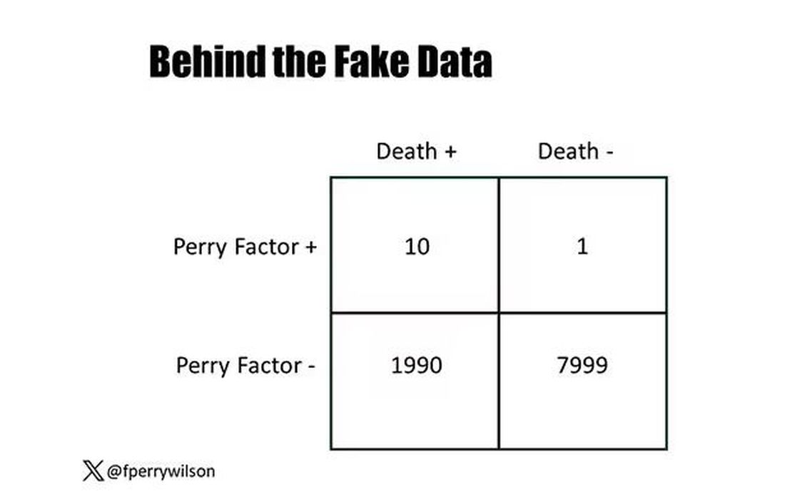
That’s quite unlikely by chance alone. It really does appear that if you have Perry Factor, your risk for death is much higher. But the reason that Perry Factor is a bad predictor is because it is so rare in the population. Sure, you can use it to correctly predict the outcome of 10 of the 11 people who have it, but the vast majority of people don’t have Perry Factor. It’s useless to distinguish who will die vs who will live in that population.
Why have I spent so much time trying to reverse our intuition that strength of association and strength of predictive power must be related? Because it helps to explain this paper, “Prognostic Value of Cardiovascular Biomarkers in the Population,” appearing in JAMA, which is a very nice piece of work trying to help us better predict cardiovascular disease.
I don’t need to tell you that cardiovascular disease is the number-one killer in this country and most of the world. I don’t need to tell you that we have really good preventive therapies and lifestyle interventions that can reduce the risk. But it would be nice to know in whom, specifically, we should use those interventions.
Cardiovascular risk scores, to date, are pretty simple. The most common one in use in the United States, the pooled cohort risk equation, has nine variables, two of which require a cholesterol panel and one a blood pressure test. It’s easy and it’s pretty accurate.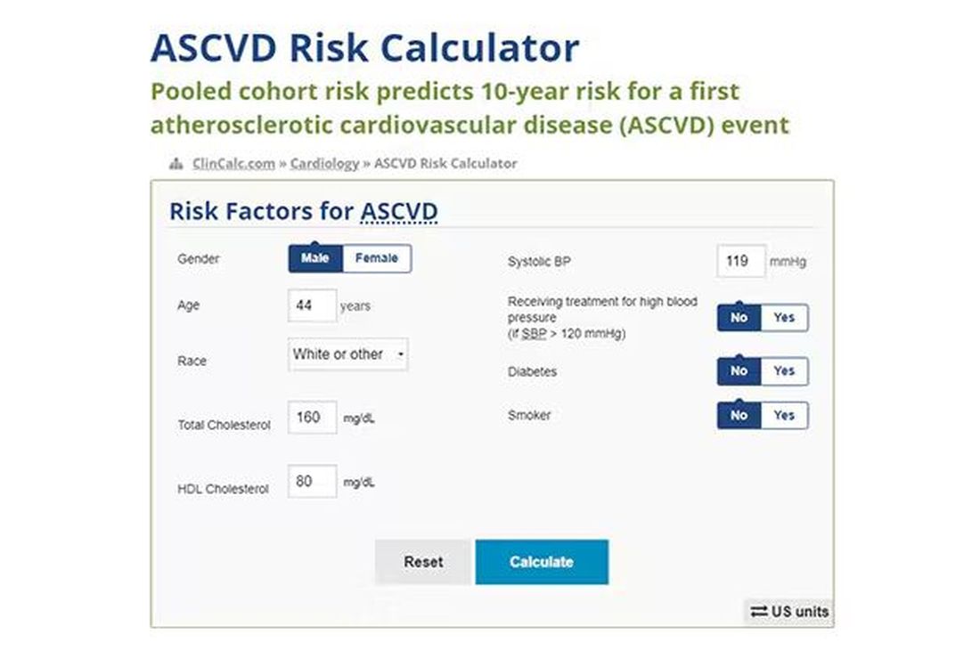
Using the score from the pooled cohort risk calculator, you get a C-statistic as high as 0.82 when applied to Black women, a low of 0.71 when applied to Black men. Non-Black individuals are in the middle. Not bad. But, clearly, not perfect.
And aren’t we in the era of big data, the era of personalized medicine? We have dozens, maybe hundreds, of quantifiable biomarkers that are associated with subsequent heart disease. Surely, by adding these biomarkers into the risk equation, we can improve prediction. Right?
The JAMA study includes 164,054 patients pooled from 28 cohort studies from 12 countries. All the studies measured various key biomarkers at baseline and followed their participants for cardiovascular events like heart attack, stroke, coronary revascularization, and so on.
The biomarkers in question are really the big guns in this space: troponin, a marker of stress on the heart muscle; NT-proBNP, a marker of stretch on the heart muscle; and C-reactive protein, a marker of inflammation. In every case, higher levels of these markers at baseline were associated with a higher risk for cardiovascular disease in the future.
Troponin T, shown here, has a basically linear risk with subsequent cardiovascular disease.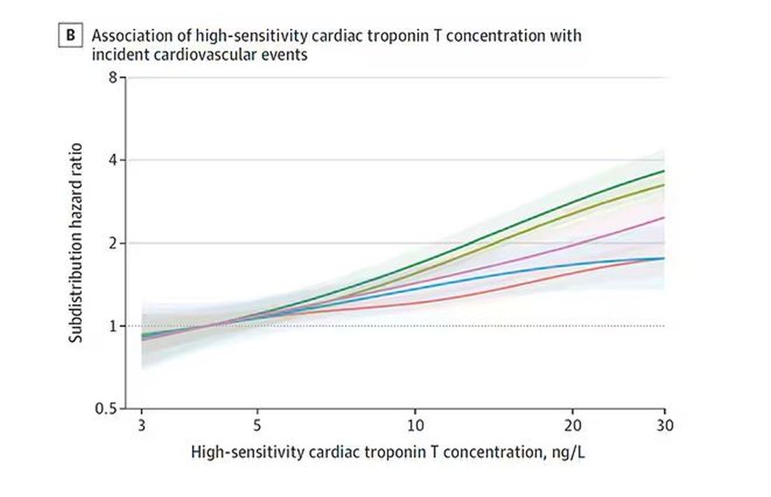
BNP seems to demonstrate more of a threshold effect, where levels above 60 start to associate with problems.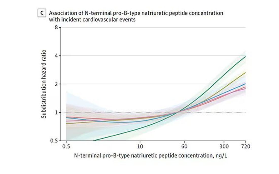
And CRP does a similar thing, with levels above 1.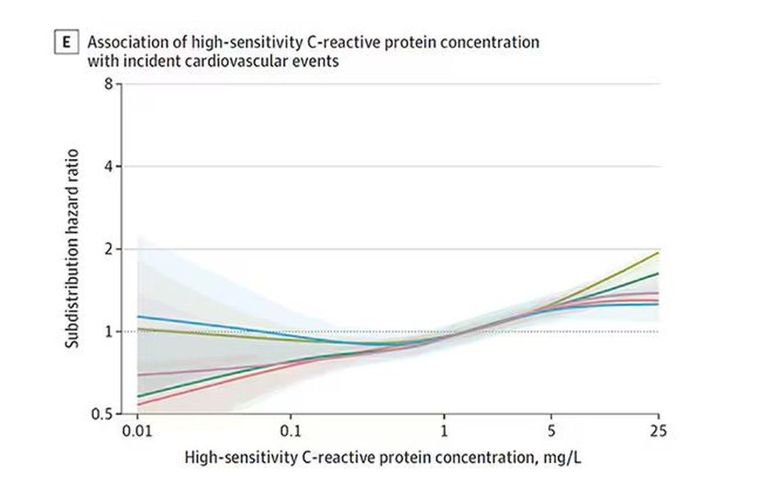
All of these findings were statistically significant. If you have higher levels of one or more of these biomarkers, you are more likely to have cardiovascular disease in the future.
Of course, our old friend the pooled cohort risk equation is still here — in the background — requiring just that one blood test and measurement of blood pressure. Let’s talk about predictive power.
The pooled cohort risk equation score, in this study, had a C-statistic of 0.812.
By adding troponin, BNP, and CRP to the equation, the new C-statistic is 0.819. Barely any change.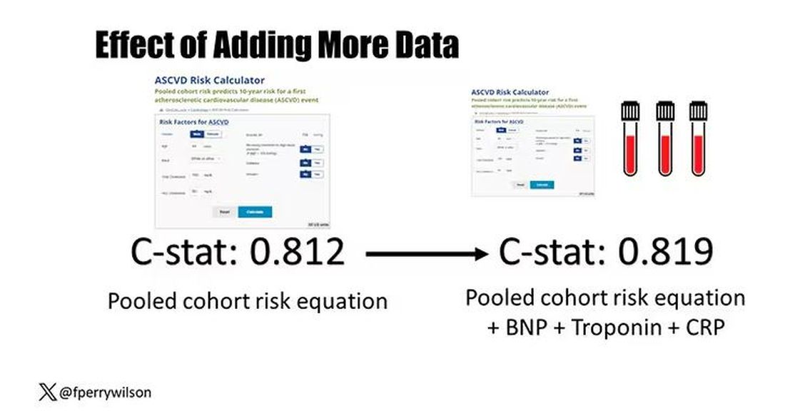
Now, the authors looked at different types of prediction here. The greatest improvement in the AUC was seen when they tried to predict heart failure within 1 year of measurement; there the AUC improved by 0.04. But the presence of BNP as a biomarker and the short time window of 1 year makes me wonder whether this is really prediction at all or whether they were essentially just diagnosing people with existing heart failure.
Why does this happen? Why do these promising biomarkers, clearly associated with bad outcomes, fail to improve our ability to predict the future? I already gave one example, which has to do with how the markers are distributed in the population. But even more relevant here is that the new markers will only improve prediction insofar as they are not already represented in the old predictive model.
Of course, BNP, for example, wasn’t in the old model. But smoking was. Diabetes was. Blood pressure was. All of that data might actually tell you something about the patient’s BNP through their mutual correlation. And improvement in prediction requires new information.
This is actually why I consider this a really successful study. We need to do studies like this to help us find what those new sources of information might be.
We will never get to a C-statistic of 1. Perfect prediction is the domain of palm readers and astrophysicists. But better prediction is always possible through data. The big question, of course, is which data?
Dr. Wilson is associate professor of medicine and public health and director of the Clinical and Translational Research Accelerator at Yale University, New Haven, Conn. He has disclosed no relevant financial relationships.
A version of this article appeared on Medscape.com.
This transcript has been edited for clarity.
It’s the counterintuitive stuff in epidemiology that always really interests me. One intuition many of us have is that if a risk factor is significantly associated with an outcome, knowledge of that risk factor would help to predict that outcome. Makes sense. Feels right.
But it’s not right. Not always.
Here’s a fake example to illustrate my point. Let’s say we have 10,000 individuals who we follow for 10 years and 2000 of them die. (It’s been a rough decade.) At baseline, I measured a novel biomarker, the Perry Factor, in everyone. To keep it simple, the Perry Factor has only two values: 0 or 1.
I then do a standard associational analysis and find that individuals who are positive for the Perry Factor have a 40-fold higher odds of death than those who are negative for it. I am beginning to reconsider ascribing my good name to this biomarker. This is a highly statistically significant result — a P value <.001.
Clearly, knowledge of the Perry Factor should help me predict who will die in the cohort. I evaluate predictive power using a metric called the area under the receiver operating characteristic curve (AUC, referred to as the C-statistic in time-to-event studies). It tells you, given two people — one who dies and one who doesn’t — how frequently you “pick” the right person, given the knowledge of their Perry Factor.
A C-statistic of 0.5, or 50%, would mean the Perry Factor gives you no better results than a coin flip; it’s chance. A C-statistic of 1 is perfect prediction. So, what will the C-statistic be, given the incredibly strong association of the Perry Factor with outcomes? 0.9? 0.95?
0.5024. Almost useless.

Let’s figure out why strength of association and usefulness for prediction are not always the same thing.
I constructed my fake Perry Factor dataset quite carefully to illustrate this point. Let me show you what happened. What you see here is a breakdown of the patients in my fake study. You can see that just 11 of them were Perry Factor positive, but 10 of those 11 ended up dying.
That’s quite unlikely by chance alone. It really does appear that if you have Perry Factor, your risk for death is much higher. But the reason that Perry Factor is a bad predictor is because it is so rare in the population. Sure, you can use it to correctly predict the outcome of 10 of the 11 people who have it, but the vast majority of people don’t have Perry Factor. It’s useless to distinguish who will die vs who will live in that population.
Why have I spent so much time trying to reverse our intuition that strength of association and strength of predictive power must be related? Because it helps to explain this paper, “Prognostic Value of Cardiovascular Biomarkers in the Population,” appearing in JAMA, which is a very nice piece of work trying to help us better predict cardiovascular disease.
I don’t need to tell you that cardiovascular disease is the number-one killer in this country and most of the world. I don’t need to tell you that we have really good preventive therapies and lifestyle interventions that can reduce the risk. But it would be nice to know in whom, specifically, we should use those interventions.
Cardiovascular risk scores, to date, are pretty simple. The most common one in use in the United States, the pooled cohort risk equation, has nine variables, two of which require a cholesterol panel and one a blood pressure test. It’s easy and it’s pretty accurate.
Using the score from the pooled cohort risk calculator, you get a C-statistic as high as 0.82 when applied to Black women, a low of 0.71 when applied to Black men. Non-Black individuals are in the middle. Not bad. But, clearly, not perfect.
And aren’t we in the era of big data, the era of personalized medicine? We have dozens, maybe hundreds, of quantifiable biomarkers that are associated with subsequent heart disease. Surely, by adding these biomarkers into the risk equation, we can improve prediction. Right?
The JAMA study includes 164,054 patients pooled from 28 cohort studies from 12 countries. All the studies measured various key biomarkers at baseline and followed their participants for cardiovascular events like heart attack, stroke, coronary revascularization, and so on.
The biomarkers in question are really the big guns in this space: troponin, a marker of stress on the heart muscle; NT-proBNP, a marker of stretch on the heart muscle; and C-reactive protein, a marker of inflammation. In every case, higher levels of these markers at baseline were associated with a higher risk for cardiovascular disease in the future.
Troponin T, shown here, has a basically linear risk with subsequent cardiovascular disease.
BNP seems to demonstrate more of a threshold effect, where levels above 60 start to associate with problems.
And CRP does a similar thing, with levels above 1.
All of these findings were statistically significant. If you have higher levels of one or more of these biomarkers, you are more likely to have cardiovascular disease in the future.
Of course, our old friend the pooled cohort risk equation is still here — in the background — requiring just that one blood test and measurement of blood pressure. Let’s talk about predictive power.
The pooled cohort risk equation score, in this study, had a C-statistic of 0.812.
By adding troponin, BNP, and CRP to the equation, the new C-statistic is 0.819. Barely any change.
Now, the authors looked at different types of prediction here. The greatest improvement in the AUC was seen when they tried to predict heart failure within 1 year of measurement; there the AUC improved by 0.04. But the presence of BNP as a biomarker and the short time window of 1 year makes me wonder whether this is really prediction at all or whether they were essentially just diagnosing people with existing heart failure.
Why does this happen? Why do these promising biomarkers, clearly associated with bad outcomes, fail to improve our ability to predict the future? I already gave one example, which has to do with how the markers are distributed in the population. But even more relevant here is that the new markers will only improve prediction insofar as they are not already represented in the old predictive model.
Of course, BNP, for example, wasn’t in the old model. But smoking was. Diabetes was. Blood pressure was. All of that data might actually tell you something about the patient’s BNP through their mutual correlation. And improvement in prediction requires new information.
This is actually why I consider this a really successful study. We need to do studies like this to help us find what those new sources of information might be.
We will never get to a C-statistic of 1. Perfect prediction is the domain of palm readers and astrophysicists. But better prediction is always possible through data. The big question, of course, is which data?
Dr. Wilson is associate professor of medicine and public health and director of the Clinical and Translational Research Accelerator at Yale University, New Haven, Conn. He has disclosed no relevant financial relationships.
A version of this article appeared on Medscape.com.
This transcript has been edited for clarity.
It’s the counterintuitive stuff in epidemiology that always really interests me. One intuition many of us have is that if a risk factor is significantly associated with an outcome, knowledge of that risk factor would help to predict that outcome. Makes sense. Feels right.
But it’s not right. Not always.
Here’s a fake example to illustrate my point. Let’s say we have 10,000 individuals who we follow for 10 years and 2000 of them die. (It’s been a rough decade.) At baseline, I measured a novel biomarker, the Perry Factor, in everyone. To keep it simple, the Perry Factor has only two values: 0 or 1.
I then do a standard associational analysis and find that individuals who are positive for the Perry Factor have a 40-fold higher odds of death than those who are negative for it. I am beginning to reconsider ascribing my good name to this biomarker. This is a highly statistically significant result — a P value <.001.
Clearly, knowledge of the Perry Factor should help me predict who will die in the cohort. I evaluate predictive power using a metric called the area under the receiver operating characteristic curve (AUC, referred to as the C-statistic in time-to-event studies). It tells you, given two people — one who dies and one who doesn’t — how frequently you “pick” the right person, given the knowledge of their Perry Factor.
A C-statistic of 0.5, or 50%, would mean the Perry Factor gives you no better results than a coin flip; it’s chance. A C-statistic of 1 is perfect prediction. So, what will the C-statistic be, given the incredibly strong association of the Perry Factor with outcomes? 0.9? 0.95?
0.5024. Almost useless.

Let’s figure out why strength of association and usefulness for prediction are not always the same thing.
I constructed my fake Perry Factor dataset quite carefully to illustrate this point. Let me show you what happened. What you see here is a breakdown of the patients in my fake study. You can see that just 11 of them were Perry Factor positive, but 10 of those 11 ended up dying.
That’s quite unlikely by chance alone. It really does appear that if you have Perry Factor, your risk for death is much higher. But the reason that Perry Factor is a bad predictor is because it is so rare in the population. Sure, you can use it to correctly predict the outcome of 10 of the 11 people who have it, but the vast majority of people don’t have Perry Factor. It’s useless to distinguish who will die vs who will live in that population.
Why have I spent so much time trying to reverse our intuition that strength of association and strength of predictive power must be related? Because it helps to explain this paper, “Prognostic Value of Cardiovascular Biomarkers in the Population,” appearing in JAMA, which is a very nice piece of work trying to help us better predict cardiovascular disease.
I don’t need to tell you that cardiovascular disease is the number-one killer in this country and most of the world. I don’t need to tell you that we have really good preventive therapies and lifestyle interventions that can reduce the risk. But it would be nice to know in whom, specifically, we should use those interventions.
Cardiovascular risk scores, to date, are pretty simple. The most common one in use in the United States, the pooled cohort risk equation, has nine variables, two of which require a cholesterol panel and one a blood pressure test. It’s easy and it’s pretty accurate.
Using the score from the pooled cohort risk calculator, you get a C-statistic as high as 0.82 when applied to Black women, a low of 0.71 when applied to Black men. Non-Black individuals are in the middle. Not bad. But, clearly, not perfect.
And aren’t we in the era of big data, the era of personalized medicine? We have dozens, maybe hundreds, of quantifiable biomarkers that are associated with subsequent heart disease. Surely, by adding these biomarkers into the risk equation, we can improve prediction. Right?
The JAMA study includes 164,054 patients pooled from 28 cohort studies from 12 countries. All the studies measured various key biomarkers at baseline and followed their participants for cardiovascular events like heart attack, stroke, coronary revascularization, and so on.
The biomarkers in question are really the big guns in this space: troponin, a marker of stress on the heart muscle; NT-proBNP, a marker of stretch on the heart muscle; and C-reactive protein, a marker of inflammation. In every case, higher levels of these markers at baseline were associated with a higher risk for cardiovascular disease in the future.
Troponin T, shown here, has a basically linear risk with subsequent cardiovascular disease.
BNP seems to demonstrate more of a threshold effect, where levels above 60 start to associate with problems.
And CRP does a similar thing, with levels above 1.
All of these findings were statistically significant. If you have higher levels of one or more of these biomarkers, you are more likely to have cardiovascular disease in the future.
Of course, our old friend the pooled cohort risk equation is still here — in the background — requiring just that one blood test and measurement of blood pressure. Let’s talk about predictive power.
The pooled cohort risk equation score, in this study, had a C-statistic of 0.812.
By adding troponin, BNP, and CRP to the equation, the new C-statistic is 0.819. Barely any change.
Now, the authors looked at different types of prediction here. The greatest improvement in the AUC was seen when they tried to predict heart failure within 1 year of measurement; there the AUC improved by 0.04. But the presence of BNP as a biomarker and the short time window of 1 year makes me wonder whether this is really prediction at all or whether they were essentially just diagnosing people with existing heart failure.
Why does this happen? Why do these promising biomarkers, clearly associated with bad outcomes, fail to improve our ability to predict the future? I already gave one example, which has to do with how the markers are distributed in the population. But even more relevant here is that the new markers will only improve prediction insofar as they are not already represented in the old predictive model.
Of course, BNP, for example, wasn’t in the old model. But smoking was. Diabetes was. Blood pressure was. All of that data might actually tell you something about the patient’s BNP through their mutual correlation. And improvement in prediction requires new information.
This is actually why I consider this a really successful study. We need to do studies like this to help us find what those new sources of information might be.
We will never get to a C-statistic of 1. Perfect prediction is the domain of palm readers and astrophysicists. But better prediction is always possible through data. The big question, of course, is which data?
Dr. Wilson is associate professor of medicine and public health and director of the Clinical and Translational Research Accelerator at Yale University, New Haven, Conn. He has disclosed no relevant financial relationships.
A version of this article appeared on Medscape.com.